Services:


Introducing Shady Fig – a well established floral + botanical styling business in Berry, NSW Australia. The team had had their previous logo design for around a decade and wanted to step it up and gain a strong consistent brand moving forward.
I remember being so impressed in my first meeting with them as they had their mood board ready to share with me, filled with inspiration and aesthetic images to be able to visually express the direction they wanted their new look. A mix of classic serif fonts made an appearance as well as custom ribbons, fine line illustrations and simple colour scheme.

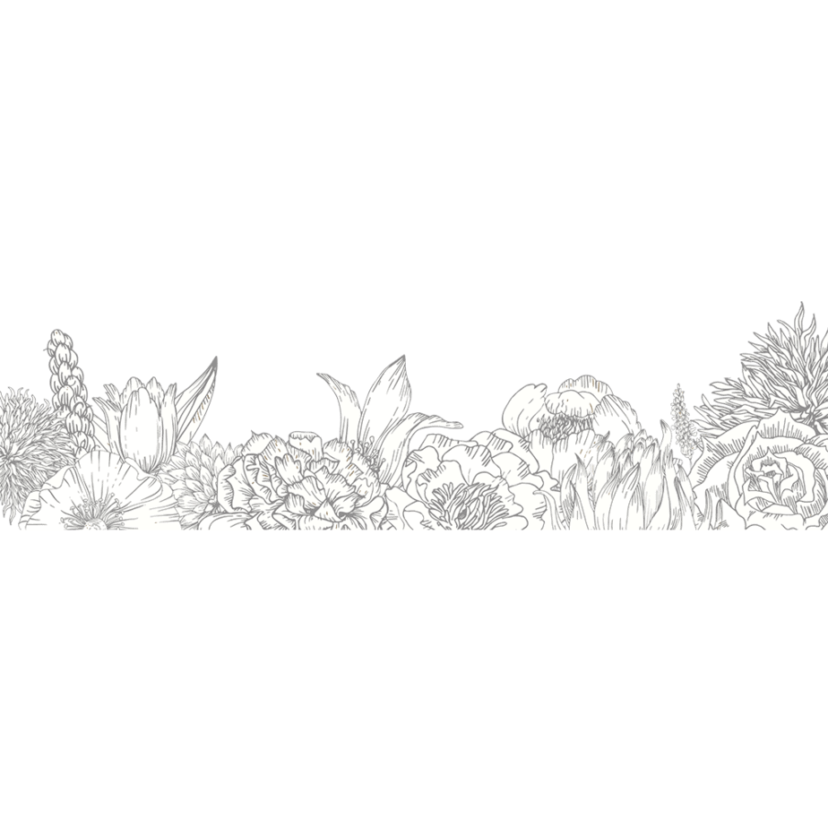
Having such a great initial understanding of what they were hoping to achieve made designing the logo concepts a really smooth process. I presented to Michelle three designs that had different fonts for options as well as a selection of fine line floral and botanic illustrations.
They chose the Hoefler font, of course, it’s such a premium ($) type but worth it as it is a simple logotype we want the typography to be a stand out.


Wanting to make each posey delivery an experience, they invested in A5 cards with rounded edges with silver foil print finish. With matching business cards, and paper stickers.
We have reprinted the cards and stickers countless of times with an Australian based printer.
It is important to gain a good relationship with a printer that care about quality and are willing to work with the designer on stock choices and materials best for the desired application. Having found our printer we are assured to get a continuous print quality again and again. Eye-catching marketing collateral such as these cards are a practical way to gain awareness around your brand.


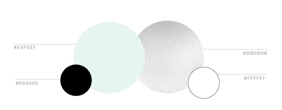
Their brand colours are a mix of a pale mint and silver foil for their print finish. A colour palette that isn’t currently trending is a smart move – not only does it make you unique as you aren’t following trends, your brand will last longer too before dating.
– Mint green inspired by nature, it is balanced and calm; a colour chosen to represent Shady Fig as it combines their love of natural elements as well as being a space of beauty.
– Silver as a print finish to give that sophisticated, premium edge. They are not appealing to the budget bunch, so we want to give their marketing collateral a touch of luxury.

Recently we installed new signage to their Berry boutique. Two matching acrylic signs border the front door adhered to the wall with silver studs. The acrylic is frosted with the main logo with tagline and their signature florals bordering the bottom. Although aren’t as impactful from far away they are soft and pretty up close and where these are located they get a lot of foot traffic.
Then there is the fascia sign with raised silver lettering against a mint background; it catches the light in the afternoon and creates an atmosphere at street level.
Recently, their website www.shadyfig.com.au has had a facelift – you can see that their branding flows through to the main page as it should feel like an extension of their business. Ordering florals locally has been a strong arm of their business revenue and it was important the site was able to save them time and be easy to use for their clientelle.
"The biggest thank you Jade for making our long journey a dream."
Michelle - SHADY FIG